Project Information
Client: FlipFood Trips
Objective: Logo Redesign and Collateral Mockup
Client Background: FlipFood Trips is a local “Turo-Turo” (Point-Point) restaurant featuring fresh Traditional Filipino Fast Food. Their Mission: FlipFood Trips brings you only quality Filipino foods that will surely satisfy your inner cravings. We strive to keep our foods home cooked style the way our foods supposed to taste like. Only fresh ingredients meticulously hand picked. Let FlipFood Trips share our passion with foods, our way of giving thanks to the community.
Original Concept
Client Notes: Clients wanted to incorporate similar elements in original logo, keep strong Filipino branding (flag, colors, flag elements of the Philippine Flag), clean up logo for use in all collateral (print), web, and other graphic design.
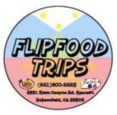
Original Flip Food Trips Logo 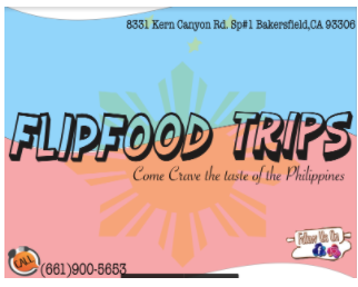
Original Flip Food Trips Postcard Logo
Design Process
Font Face
If you’ve ever been to the Philippines and ventured into the provinces, much of the signage design aesthetic is simple, but bold font-usage and an overall fun and entertaining, almost comical aspect is almost always the case.
For Flip Food Trips, we needed to evoke something similar, but not so comical that we don’t take this company seriously…because honestly their food is ridiculously good.
Initial Font-Face design

Kind of fun, but not too fun. Makes you want to go on some trip, maybe?
Design Elements
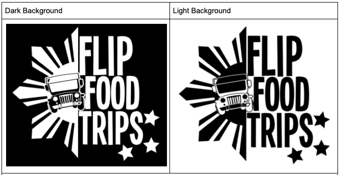
The Philippine Flag
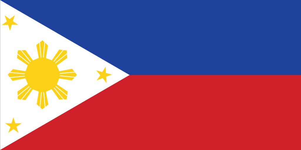
The Philippine Flag has several design elements: Color, Sun, and Stars.
I’m most drawn to the Sun sitting in the center of the equilateral triangle (each side of that triangle symbolizing Liberty, Equality, and Fraternity). Each ray of the 8 rays protruding outward of the sun with 3.75 degree spacing represents a province in the archipelago that was involved in the 1896 Philippine Revolution against span. Such a cool history lesson.
I decided to use this element, but not the whole of the element. Cut it in half and place it around the text element.

We’ve got most of the elements of the flag here, the colors and a portion of the sun. Cutting the sun in half gives a feeling of Rising. Also consider that this restaurant is sharing the Philippine culture with Fil-Ams or Filipino 2nd and 3rd generation immigrants. Showing half of a sun reminds us of our roots, while also valuing the fact that we are Americans, Filipino Americans.

Jeepney
What is the most iconic vehicle in the Philippines? Of course, the Jeepney.
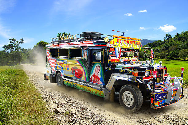
These iconic vehicles are a remnant of World War II. While the Philippines was used as a base in the Asian-Pacific theater, Americans brought and left their old military Jeeps. After the war, resilient Filipinos converted these into multi-passenger vehicles, and the Jeepney was born. Today you can find Jeepneys everywhere. They are one of the most resilient symbols of Filipino ingenuity, design, and culture.
So why not include this here. We are, after all, going on a Filipino Food Trip!

Final Logos