Project Information
Client: jayagudamixology.com (Me!)
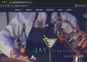
Objective: Logo Design with collateral Mockups
Client Background: This is oddly self-serving, but ya know, when you got a side gig to supplement your daily teaching job, you gotta use some flair! Jay Aguda bartender grew out of my experience working for various catering agencies during my years as a 9th grade teacher. Someone once told me, “Dude, you can be your own boss…”
As I began to roll my eyes, thinking of the multi-level-marketing spiel that I would undoubtedly have to sit through, he continued, “yeah, look bartend for parties and private corporate events.”
And Jay Aguda Mixology was born. I’ve since moved on to a different job, still in education, and let this fun hobby fall into the wayside. I’ve recently revived it when a friend of ours asked me to bartend her parents’ 50th wedding anniversary. I’m back, baby. What can I mix for you?
Original Concept
Client Notes: Years of bad clubs and gross dives (yes there is a time and place for a McLaren’s bar (cue HIMYM fans), but with my aging palette and my interest in fresh things, I wanted this brand to signify classiness in the craft of mixing cocktails.
I try to visit the local “speakeasy” style bar at every city I visit. One of my faves in my own city is Varnish, a tiny, hidden bar inside some unassuming backdoor at the back of Cole’s french dip sandwich restaurant on 6th street in downtown LA. Yeah, I know, the Varnish doesn’t have their own logo (in line with their vibe of being a secret speakeasy), but that’s not what I wanted to emulate.
I wanted to emulate a touch of class, evoke emotions that I felt watching this bartender chip away at a solid block of ice to reveal a square, ultra-clear, cube of ice with which she used to cool my gin fizz.
Something classy, but something fun.

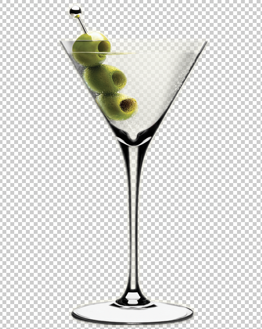
What visual element is more classy than a martini glass
Design Process
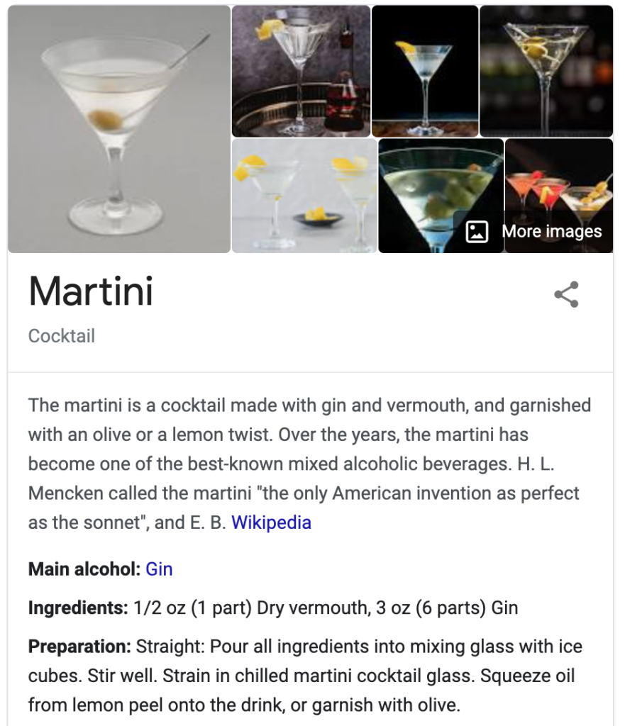
Design element: the Martini Glass
What drink evokes the most class? The Martini.
Think about it, it’s 007 who ordered it prepared in what is arguably the most famous way of making the drink “shaken, not stirred”, though I prefer my Martini stirred so as to not bruise the expensive Gin or Vodka, but that’s a blog for my other site, jayagudamixology.com. And, tbh, Martinis aren’t my fave of cocktails (see, Bourbon Old Fashioned on that same site).
But whatever your fave cocktail, the shape of a Martini glass is unmistakeable. The inverted triangle atop a stem is ubiquitous with the classiest of mixologists.
So this is where it began.

Ubiquitous, classy. Martini – Stirred, not shaken.
Font Face
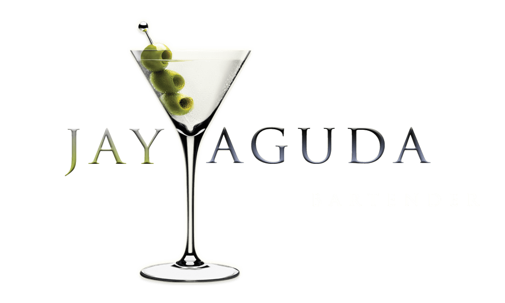
Clean, Serifs. Old + New = Classy.

Wrap the text around the Martini.
Final Design
jayagudamixology.com


